

I was asked by several readers how I create the Sankey diagrams in my monthly updates. So I thought I write a quick post about it.
Kudos to Tony whom I asked originally because I’ve seen the Sankey diagrams in his monthly updates and liked them a lot.
Definition
Sankey diagrams are a type of flow diagram in which the width of the arrows is proportional to the flow rate.
Sankey diagrams can also visualize the energy accounts, material flow accounts on a regional or national level, and cost breakdowns.
Sankey diagrams emphasize the major transfers or flows within a system. They help locate the most important contributions to a flow. They often show conserved quantities within defined system boundaries. (source Wikipedia)
The Tool
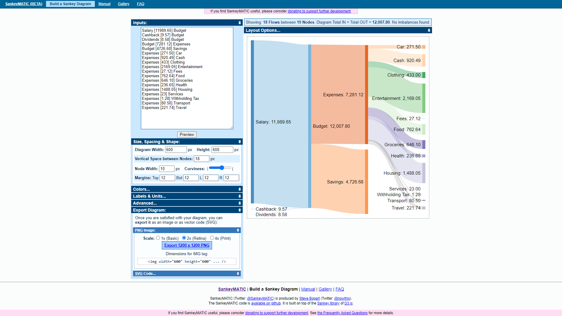
I use the Sankey generator from sankeymatic.com it’s pretty straight forward and has a color palette which I like.
Creating a new diagram is pretty straight forward, you click on the “Build a Sankey Diagram” link and input your data.
The Data
To get a useful Sankey diagram you first need to have some structured data. I use the numbers from the “Income Statement” of fava (a web tool to visualize beancount ledgers). I filter for the month I want to extract and make sure to convert all numbers to CHF.
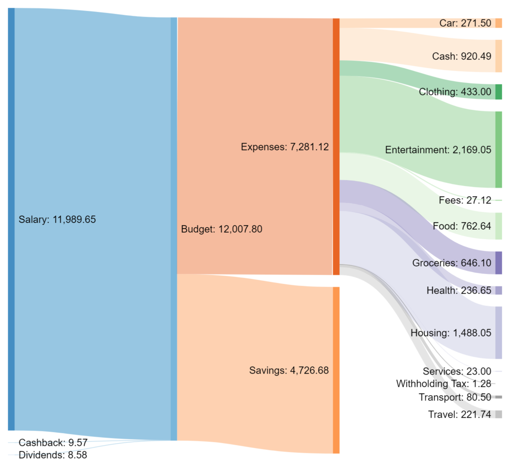
Here its how it looks:
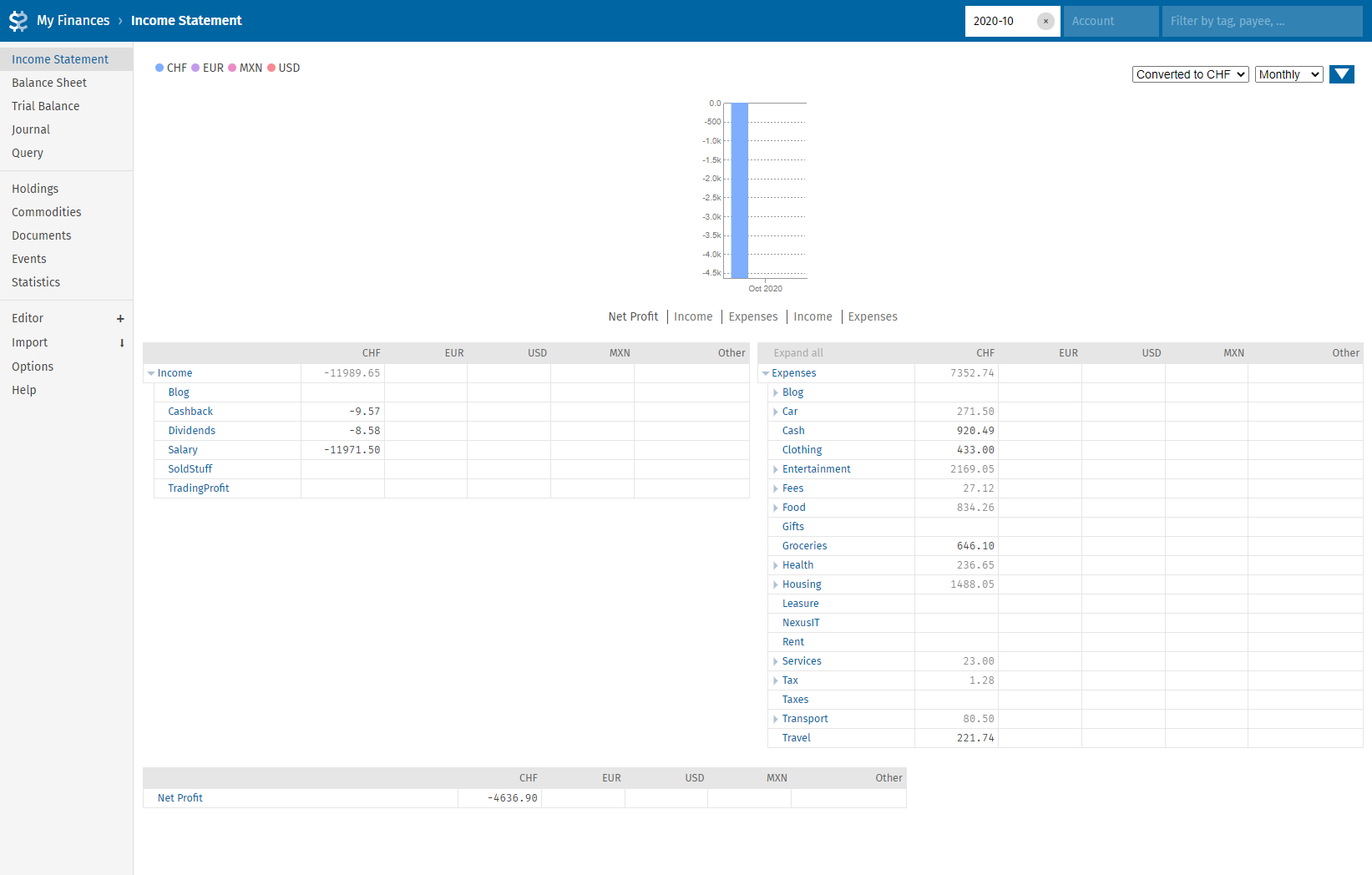
For the diagram you always need balanced spending input data. For the screenshot above I would end up with the following Inputs for the tool:
Salary [11989.65] Budget
Cashback [9.57] Budget
Dividends [8.58] Budget
Budget [7281.12] Expenses
Budget [4726.68] Savings
Expenses [271.50] Car
Expenses [920.49] Cash
Expenses [433] Clothing
Expenses [2169.05] Entertainment
Expenses [27.12] Fees
Expenses [762.64] Food
Expenses [646.10] Groceries
Expenses [236.65] Health
Expenses [1488.05] Housing
Expenses [23] Services
Expenses [1.28] Withholding Tax
Expenses [80.50] Transport
Expenses [221.74] Travel
If you end up with an imbalance the tool will nicely let you know, just fix it or ignore the error.
After adding those values to the Sankey tool I pretty much end up with the diagram in the header of this post. I usually tweak the size of the image and the colors if I don’t like them and then use the “Export Diagram” option with “PNG image” at the “2x (Retina)” setting.
I hope this little post helps some people to produce nice Sankey diagrams for their purposes. Feel free to link your blog post with a nice Sankey diagram in the comments below.
That’s a well-written explanation. I originally learnt about it thanks to Route2FI.
Also had loads of people asking but never written anything about it. Next time I’ll know where to point them out. 😉
Thanks Tony.
Great to see what is possible with freeware tools.
I know Sankey from SAP and Qlikview Technology stack. But this really covers all needs
Very cool! 🙂 Thank you
cool. Thank you it’s a really nice chart
Great idea! I love this to show where money comes from and where it goes. It also works great with percentages (for those of us who don’t like to reveal specific amounts). In my case the Sankey diagram was an eye opener to see how little passive income I have…
That’s true it also works with percentages very nicely. I hope you’re doing well, take care.
cool, thanks ! May I suggest to make the images in the blog posts “clickable” to enlarge their size ?
Keep up with the good work ! 🙂
Thanks for the feedback. I made the two images clickable.